What’s your look? The way you dress; your hairstyle? When did you last change it? A new style takes effort – is it worth the risk and investment just to look hip?
I’m Rudolf Burgaj, Design Lead at phpList, and in this article, I will guide you through upcoming changes to the brand, including colour palette, typography, imagery, and logo. Let’s dive into what’s coming and why (the new full Guidelines document is at the end of this post).
Logo
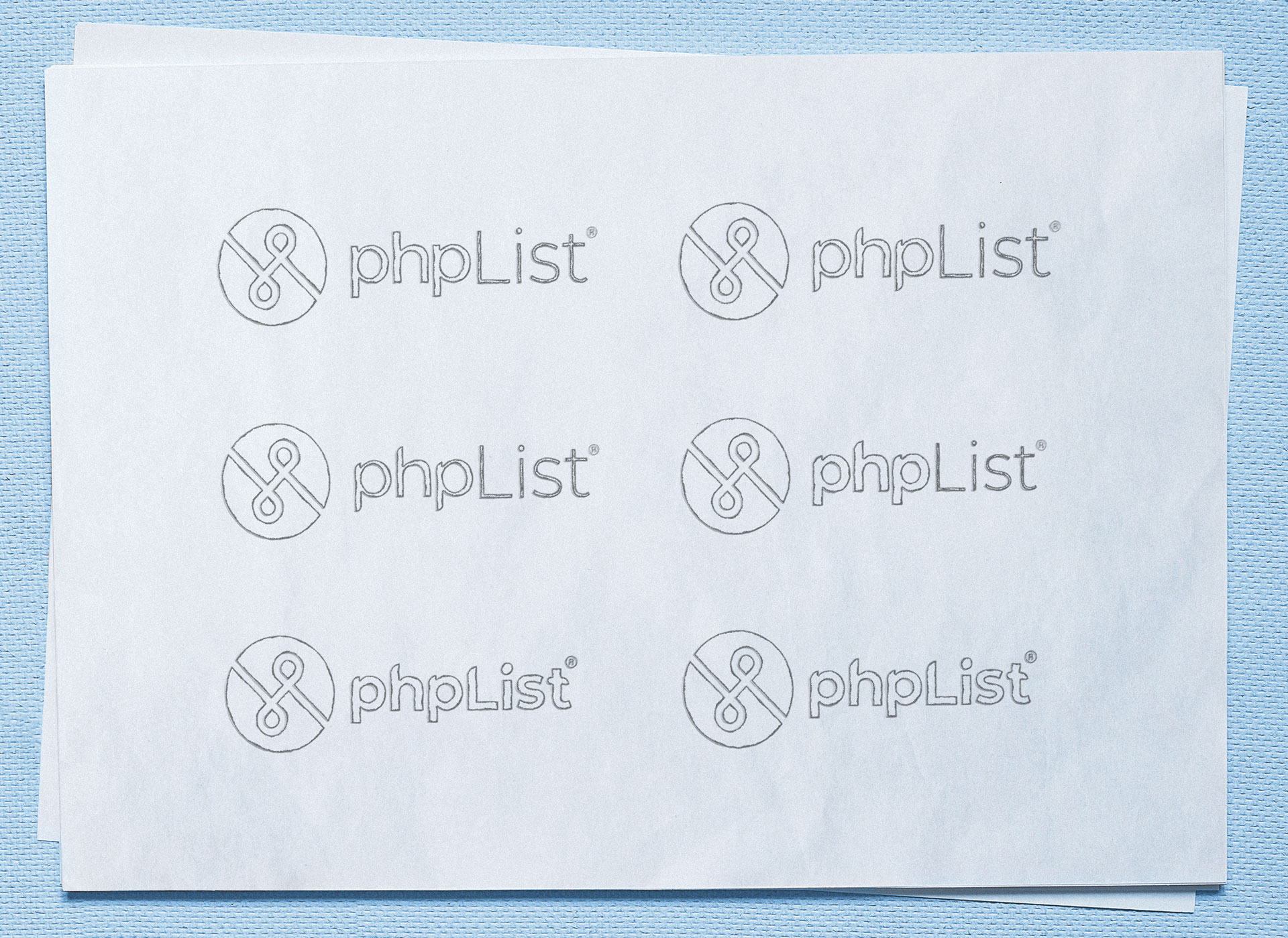
The phpList logo with ‘double ribbon’ icon has represented the project for a decade, and it remains the most recognisable brand component. Changing the logo is a big deal, and we pursued an evolution, which kept the recognisable elements while morphing both text and image towards balance and harmony.
The logo is based on a grid system, which maintains precise proportions and relationships between elements. The height of the letter ‘s’ provides the basis for space around all other letters. Half of the height of the ‘s’ equals the spaces between the round double ribbon symbol and logo text.
The round logo mark is formed by a circle and a line inside that, crossing itself and forming the letters ‘php’. It is exactly double the height of the logo text.
From experience, we know that the ‘php’ letters contained within the old circular logo image was often missed by viewers. The new logo includes a gradient forming a shadow beneath the letters P to emphasise the letter H and the meaning of these letters. The shadows also evoke a three-dimensional factory conveyor-belt system and associated notions of efficiency and mechanised production. These relate to phpList’s automated and scalable nature – it creates and manages tens of billions of communications yearly.
The ribbon shape has been slightly adjusted to adopt proportions of the Fibonacci Sequence, and achieve greater visual harmony.
The logo type is based on the Montserrat Open Source font. After experimenting with many variations, we found that the clearest look was with bold text throughout. The goal was to keep a consistent look across all letters, maintaining the capital ‘L’ of ‘List’, while demphasising it and increasing visual conformity among all the letters, to present the word as a single whole. A soft arc exists across the top of the outline of the wordform, rising from the ‘p’ on the left to its height at the tip of the ‘L’, and back to the right-side cross of the ‘t’.
In the end, the Montserrat glyphs were modified so much that it’s hard to see their original form.
Colours
In the pursuit of beauty and harmony colours are key. phpList has an established colour palette representing the various places the brand is applied. From this, new tones of blue and orange were derived (used for phpList.com and phpList.org respectively), and fresh greens and off-black were added. Blue and orange are complementary colours, providing a foundation for a wide range of attractive graphics

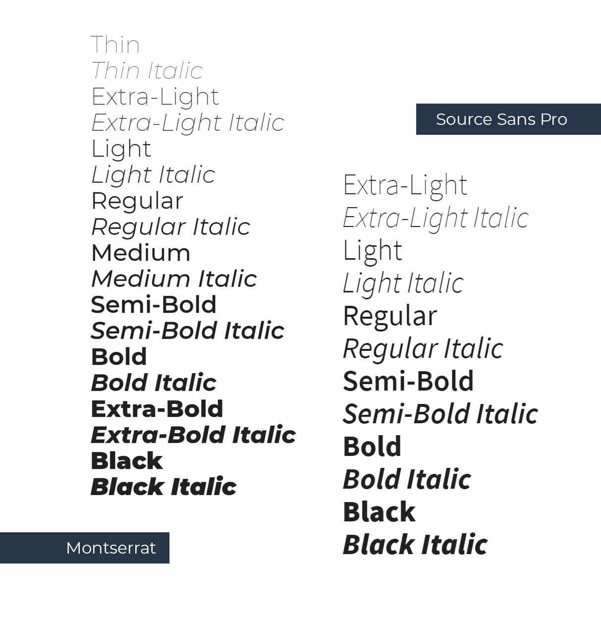
Fonts
Hundreds of fonts were reviewed in the quest to select new ones for the brand – picking the right ones to reflect the brand personality was hard. Serif fonts are currently trending, not least among email marketing firms. Sans Serif fonts were finally selected for their clean and professional character: Montserrat for headings and titles, and Source Sans Pro for body text. These fonts will also cater well for the 43 languages that phpList has been translated into, as each of them contain the necessary glyphs for these and 92 other languages.
Imagery
Software is abstract, photographs are concrete. Images illustrating freedom and openness have been used for years on phpList websites to evoke these feelings in association with the unique and radical benefits of Open Source. Those images served as visual metaphors, depicting things like birds in flight, and natural open spaces.
The updated brand needs photography too, of more immediately relevant and relatable scenes. We chose to seed the new brand photography with people in the kinds of environments in which small and medium-size organisations frequently use phpList in. That is: relaxed, self-directed, collaborative, of diverse age and nationality, and within flexible working environments.
While these images are primarily intended for phpList.com, more brand photography for phpList.org will be added in time.
Rolling out
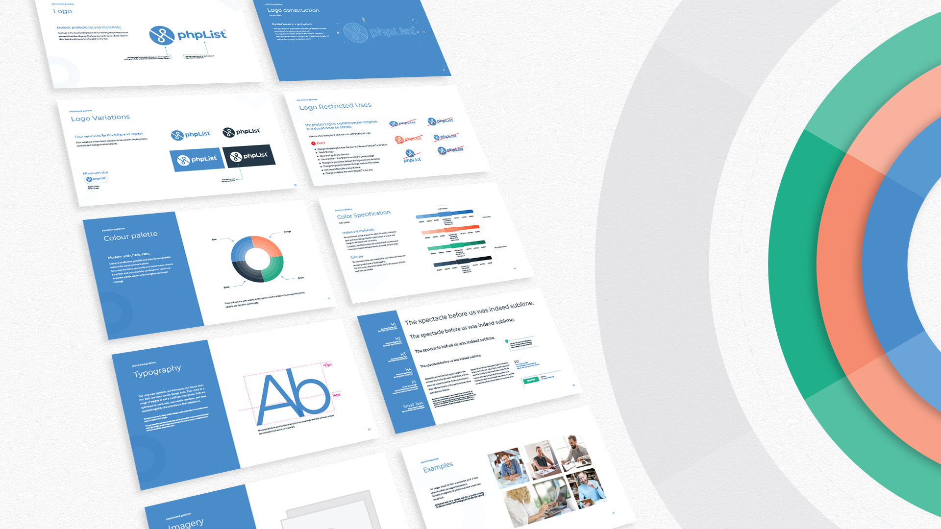
For a detailed interpretation of all the above, you can check the phpList branding guidelines document.
The new phpList brand has already started to roll out to our properties, and very soon you’ll see it applied to phpList.com. It provides a more precise identity for the world’s most popular Open Source email marketing solution — look out for it wherever you interact with phpList!
Brand_guidelines_phpList_web_RGB